The Challenge
Enhance the donation process for reBOOT Canada for a more seamless experience
The Solution
Revamp the home page for greater influence and smooth out the donation procedure
Timeline
1 week
Role
UX Design Landing Page
THE BRIEF
During the boot camp, we were tasked with helping social impact organizations articulate their value proposition and motivate individuals to drive positive change.
We had one week to select an organization and revamp the donation experience.
Our team of four chose to redesign the landing and donation pages for reBOOT Canada. After a quick review of the existing website and team discussion we divided the tasks.
My main focus and role in this process was synthesizing the data collected from user interviews, and redesign the flow and design based on the user insights collected.
reBOOT CANADA
If you are wondering what is reBOOT Canada and what exactly they do; they are a charity with the primary purpose of making the internet and digital tools accessible to under-served communities and individuals across Canada so they can be connected, build capacity for self-sufficiency and improve their employment and education prospects.
Guided by their core values of sustainability, innovation and environmental stewardship, accountability and education their mission is to enable all Canadians to become fully functioning members of the society by providing subsidised access to technology.
They are working to bridge the digital divide that exists within organizations and individuals who cannot otherwise afford access to technology.
THE VALUE
1 Million tons
of e-waste in 2020 was produced by Canadians that is expected to reach 1.2 million tonnes annually by 2030
Electronic donation provides a sustainable alternative to disposing of old devices. Instead of letting gadgets collect dust or add to the growing e-waste problem, they can be repurposed, refurbished, and given a second life.

INITIAL ANALYSIS
Through our analysis of the website, we discovered that the web pages are primarily text-focused and lack a clear visual structure, which could overwhelm users. The website's design consistency and user experience could be enhanced. Completing donations is challenging for users due to the complex and overwhelming process.
To simplifly the donation process we chose to revamp the landing and donation pages.
The donation page
Unending scroll
The existing donation form on the charity page demands substantial scrolling, which can frustrate the users and unnecessarily complicate the process
Inconsistent form designs
The donation form's styling is inconsistent and lacks categorization and arrangement, complicating the completion process.
Confusing forms
There are two distinct forms on the page: a device donation form and a cash donation form. Each with their own visual layout that is confusing.
The landing page
Text heavy
Content that lacks visuals and a clear visual hierarchy can overwhelm readers and make it difficult to scan different sections of the landing page, resulting in cognitive load.
Needs a distinct 'call to action'
The introductory hero segment fails to distinctly highlight the primary action expected from the user, and how contributing to the charitable cause can be beneficial for them
Misses human bonding
As a non-profit entity, this page lacks personal visuals and testimonials, as well as stories speaking to the transformative impact of reBOOT. This content would empower users to connect with and believe in their cause.
TESTING WITH THE USERS
To validate our initial analysis and identify specific challenges in the donation process, we got 5 participants to use the current website and try donating a laptop.
Throughout the tests, three consistent issues kept arising that .

Cognitive Load
The users felt lost and overwhelmed by the volume of information by the time they got to the actual donation form. This led them to not wanting to donate through the website
Form Design
Users felt they had to fill in a lot of information in order to donate which caused them frustration and drop the process
Eligibility & Tracking
Users wanted a clear indication to check their donation meets the criteria of what can be donated. Upon completion, they sought a method to keep tabs on their contributions.
THE TARGET
Testing with the users gave us an idea of our target user group that led us to building the pesona of Alex.

THE SOLUTION
With a clear understanding of the areas for improvement, our team engaged in discussions around design strategies that could substantially refine the donation process
After exchanging ideas, we ultimately agreed on the best solution and wasted no time in translating our thoughts into sketches.
Our approach to simplifying the form filling process involved breaking it down into smaller, digestible steps for the convenience of our users.
For the landing page we chose to redesign certain sections and restructure the content of the website.

Design constraints
Before we moved on to the hi-fi redesigns, we had to make sure the changes still represent the brand.

PRESENTING reBOOT 2.0
View Prototype
Before we moved on to the hi-fi redesigns, we had to make sure the changes still represent the brand.
The donation form
To streamline the donation process, the information about donatable items was moved to a separate page.
The form was broken down into three parts, making it more digestible and less overwhelming.
The form now includes a stepper, allowing users to easily track their progress.
Added a tracking code functionality, enabling users to keep tabs on their donations.
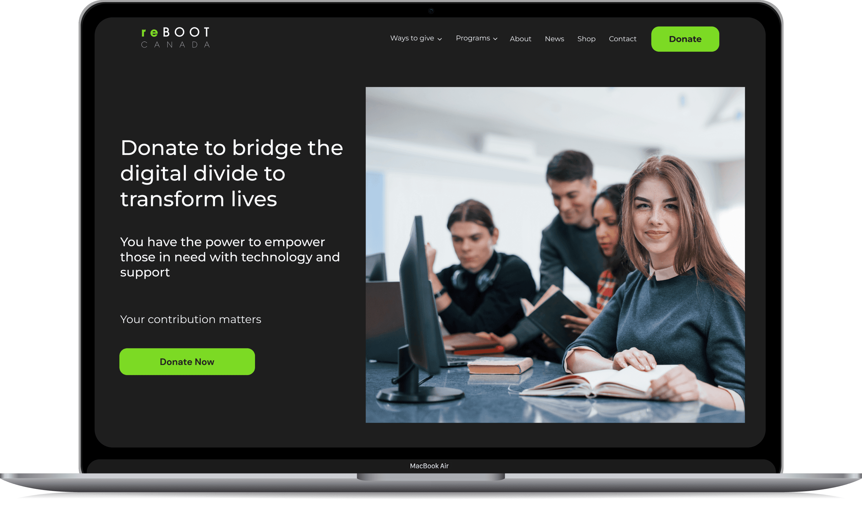
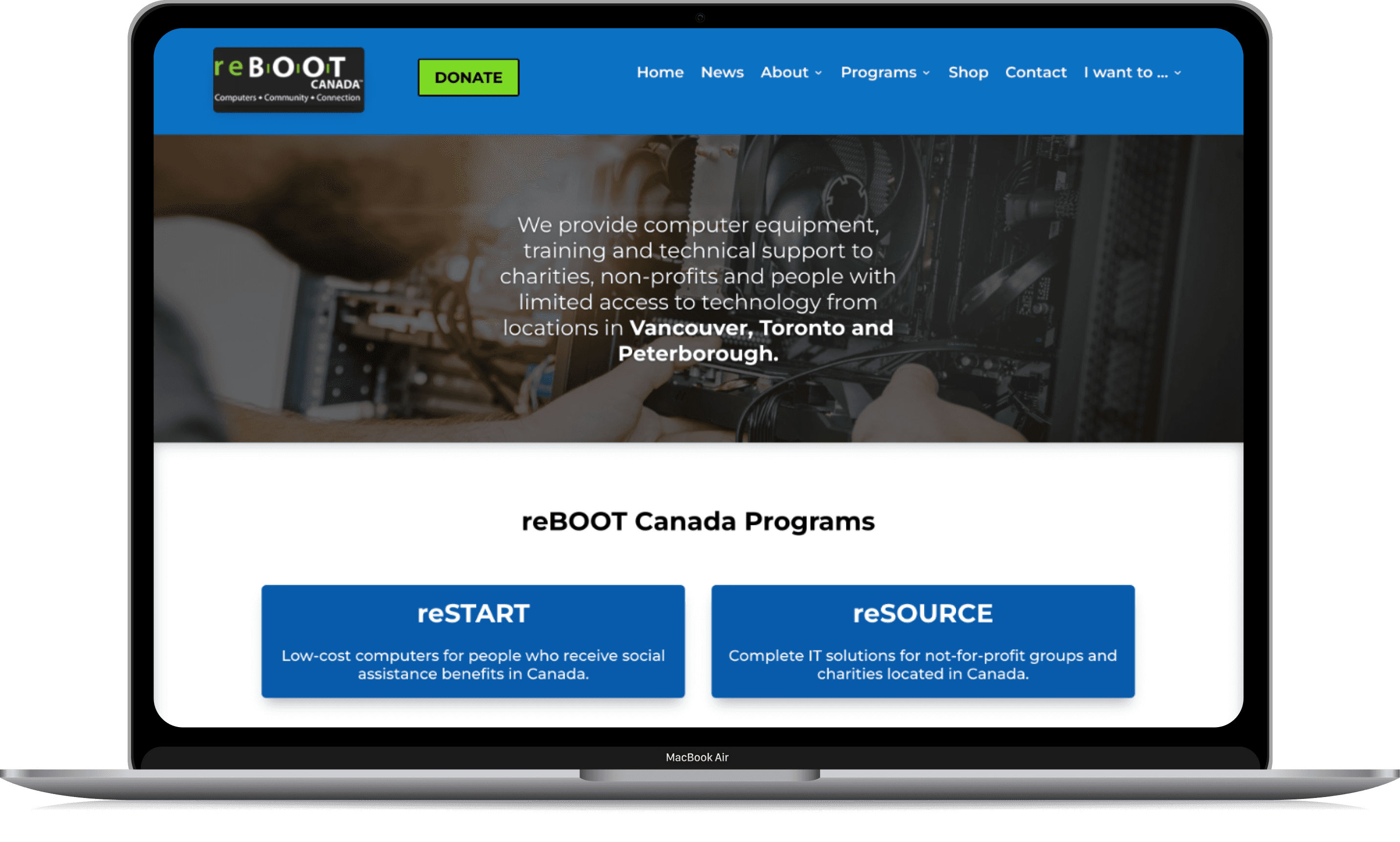
The landing page
The hero section features copy that supports the cause and prominently displays a "donate now" call-to-action.
To make a greater impact, the value and numbers are highlighted.
Including testimonials and an FAQ section will enhance the value of reBOOT by showcasing the positive impact it has had on individuals.
A more visual and sectioned landing page with content that helps users connect and belive in reBOOTS cause.
Optimising the user experience
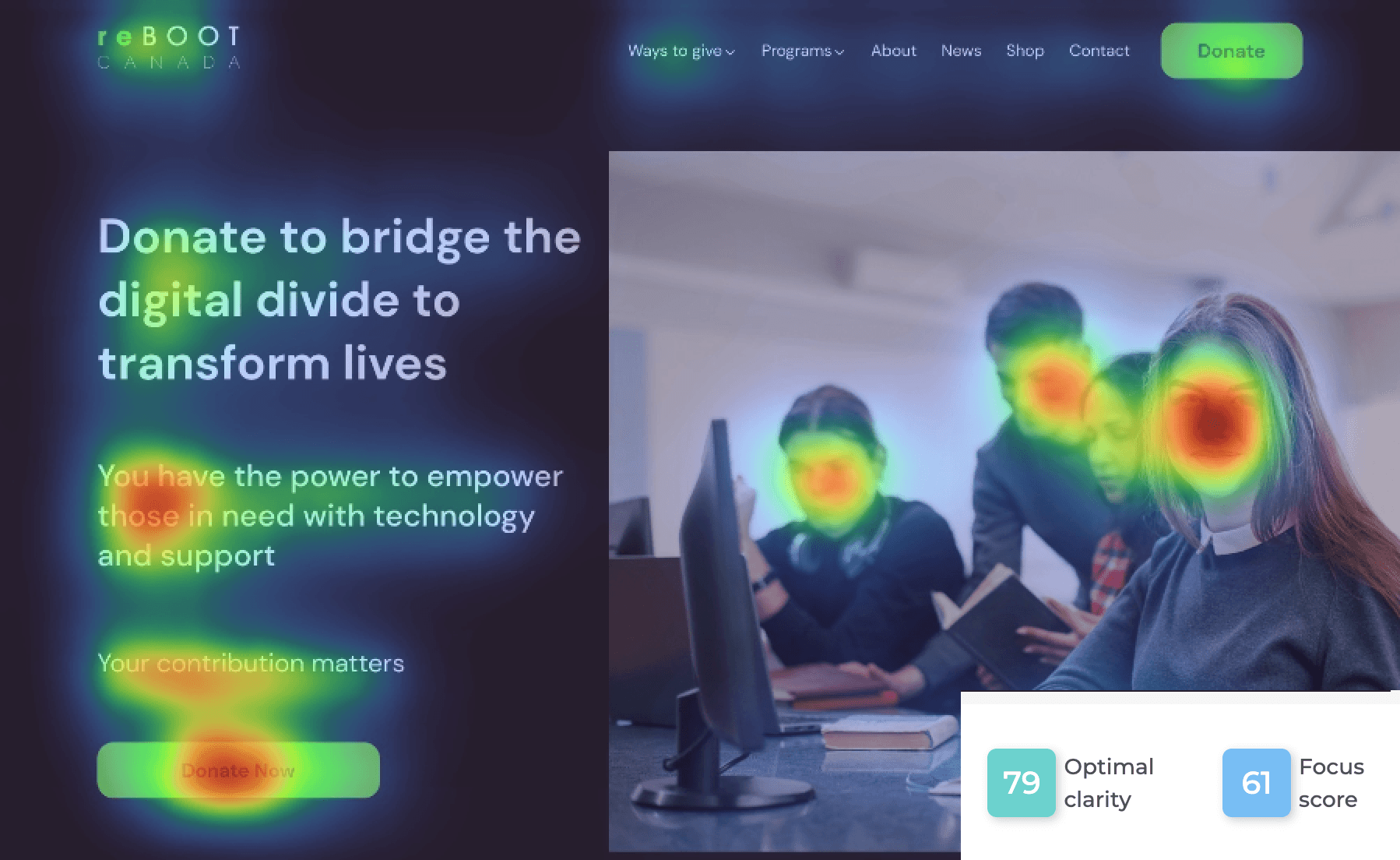
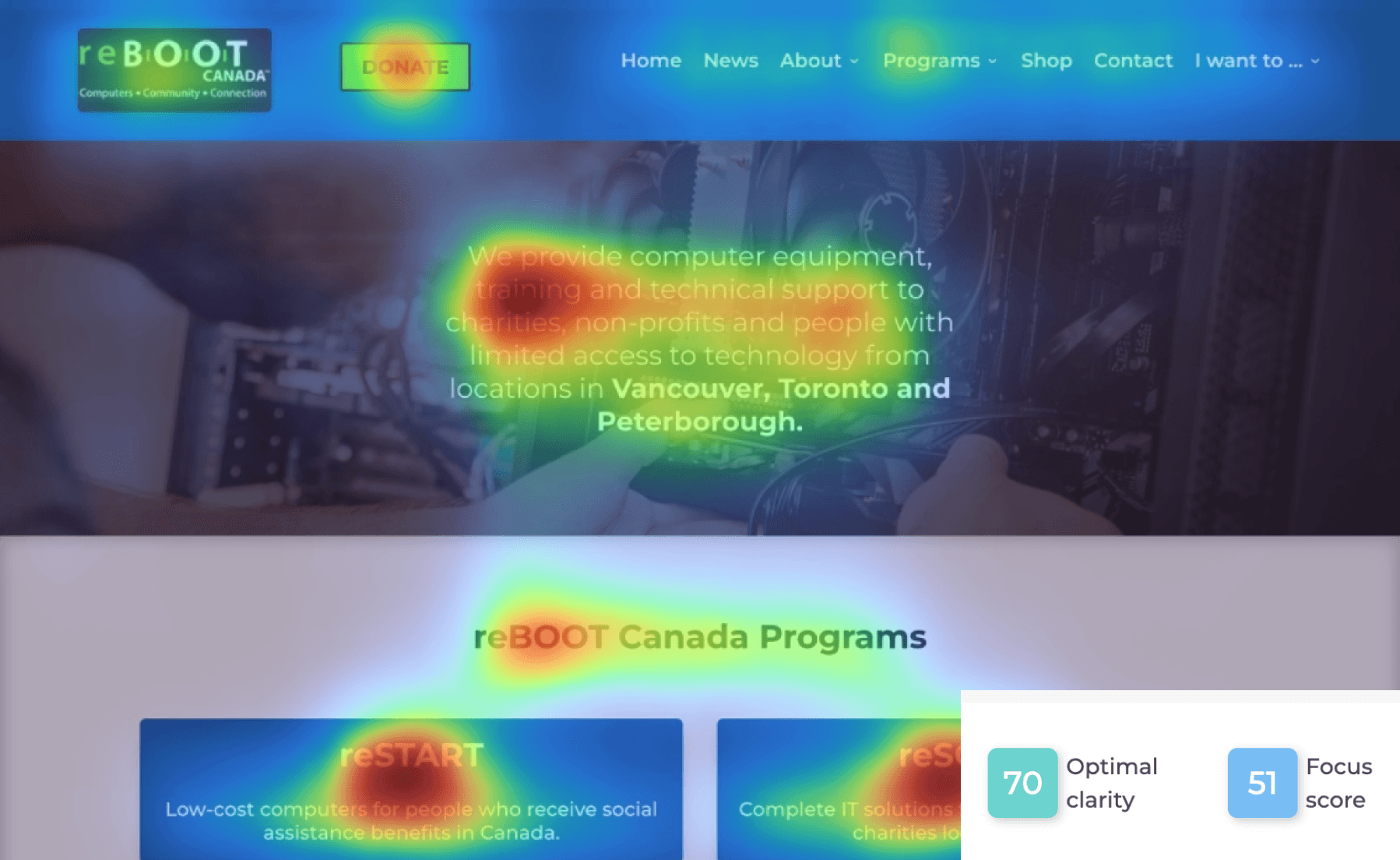
To understand the effectiveness and understand if the redesign works we used a heatmapping Figma plugin that highlights the areas of engagement and gives a clarity and focus score
New Design Heatmap
Old Design Heatmap
Old V/S new
New
Old
MY EXPERIENCE

This was a fun week long sprint, four of us took over a conference room and brainstormed ideas together. A lot of coffees, post-its and markers were involved
I came to understand the importance of structuring content and recognized that dividing information into smaller portions facilitates users' understanding of it.
I came to realize the significance of splitting tasks and collaborating as a cohesive team.

That's our happy faces after we presented our redesign to our peers and educators